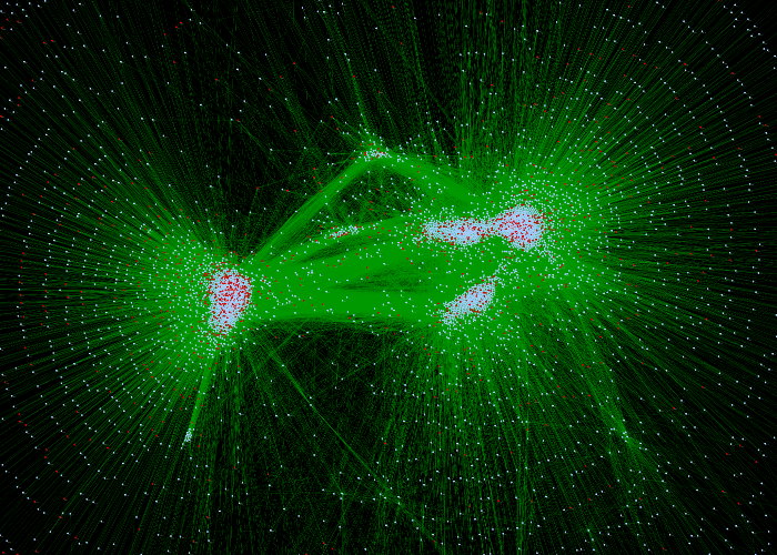
I'm giving my first poster talk of my graduate school career tomorrow, along with approximately half of my cohort (the other half had their posters today). We are supposed to present what we accomplished over the past 10 weeks, during our first rotation. Though I understand that the real purpose of this poster session is to practice our communication skills and have the to opportunity to see what our peers have been doing, it's still mildly frustrating to feel like you don't have enough material to work with. Let's be honest, it's basically impossible to do enough novel research, in a field you're new to, in 10 weeks, to adequately fill an entire poster.
I wanted to upload the entire poster here, but there are probably some issues with that. On going research and all... But, I've gotten a couple of compliments on my poster design, so I'm thinking that I may use it as a template in the future. I've removed most of the text and details from the poster, so you can give me feedback on the visual aspects. A couple of things to take into consideration: there's a difference between an empty and filled poster, and some of the specifics of the current layout are a bit "bloated" to make up for the fact that there wasn't a ton of content (a bit more could be squeezed in, I'm sure).
Also, check out that QR code. It can take attendees straight to some of my microscopy videos, to help them visualize what I'm talking about. It wasn't my idea, but it's still pretty exciting. Here's the link it takes you to :
https://www.youtube.com/user/jessime100
You can watch one of the videos here too, if you prefer.
But back to the actual poster, I'd gladly take any comments or suggestion about layout, style, design, etc.


No comments:
Post a Comment